Ciaran Daly
UX Design & Research

ANTI-VIOLENCE PARTNERSHIP OF PHILADELPHIA
A Philadelphia nonprofit looks for a web site refresh.
TOOLS
Sketch
Adobe Suite
METHODS
Wireframing
Prototyping
Heuristic Analysis
Competitor Audit
MY ROLE
Web design
Logo design
Liaising with client
Rebranding and microcopy
“The first thing I want you to know is, I didn’t build this web site.”
Alex cut right to the chase. He was under no illusions about the state of Anti-Violence Partnership of Philadelphia’s current web presence, and he knew they needed to look outside the organization for the skill set to tackle a redesign. A quick look at the scope he had proposed for the project showed me he had already given careful thought to simplifying and reorganizing the site map. We quickly reached consensus on the site’s overall structure. The main goal: driving traffic to their donation page, which was not performing to expectations.
Performing a competitor audit on leading nonprofits and their award winning sites, it quickly became obvious that AVP’s focus on trying to drive traffic to their social media was muddying the waters and an unnecessary step in the donation process, a cardinal sin in shopping cart design. My redesign used clear signifiers to drive donors towards the lucrative subscription model that is the backbone of cash flow generation in the nonprofit world.
Social media links were moved to the redesigned footer, where most users expect to find them.
Equally important was driving traffic to the donation page from within the site: the streamlined nav bar used an urgent red color uniquely for that call to action. Nav bar options were pared down to Victim Services, About Us, and Get Involved drop down menus.

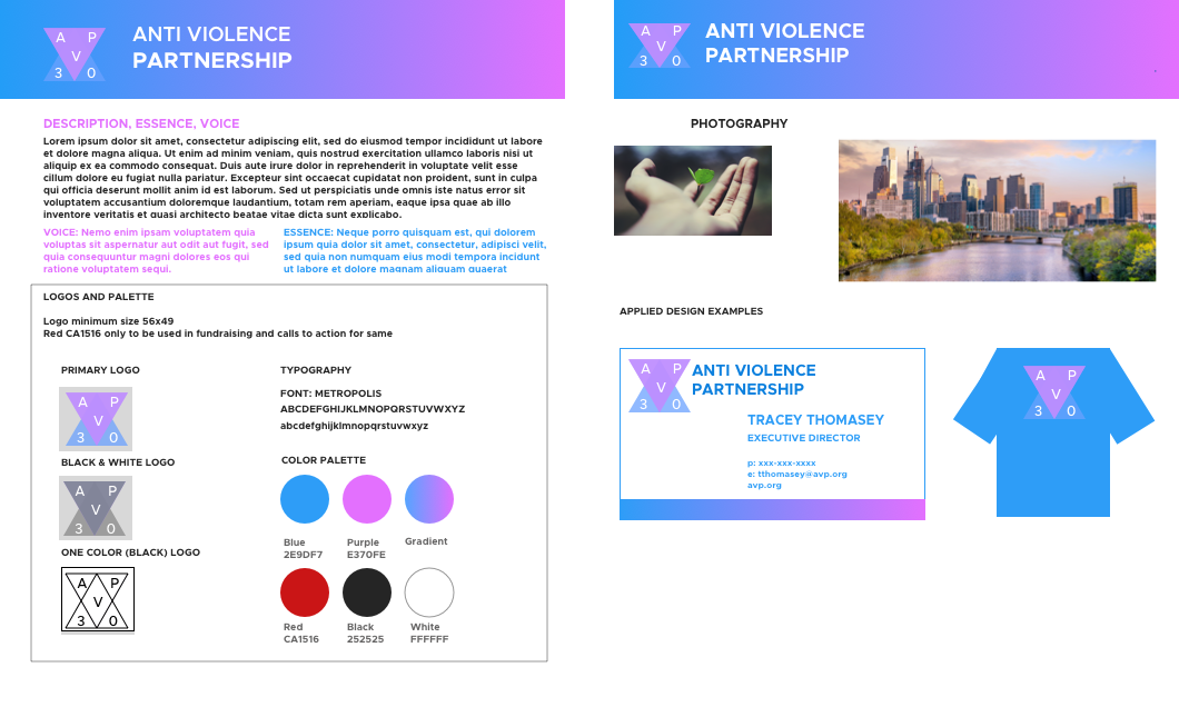
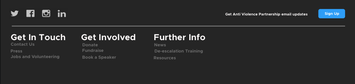
AVP has deep roots in the Philadelphia community, having worked on behalf of victims of violent crime for three decades. Updating the look and feel of the site had to be handled with sensitivity and acknowledge the often somber realities of their mission. Sourcing images that reflected the city they were interwoven with as an organization, I reached out to stakeholders within AVP to gauge the imagery they wanted foregrounded. Beautiful but gritty images of inner city Philadelphia were set aside for more hopeful panoramas of the skyline at dusk.

Logo redesign, although outside the initial scope of the project, was soon seen as integral to what was by now a wholesale rebranding. The dove was initially proposed, both as a symbol of peace and echoing Pennsylvania’s state bird, the mourning dove.
However, AVP staff were leery of giving the impression they were religiously affiliated, especially as they serve a religiously diverse community. A pivot was called for, in this case to a more neutral, geometric shape of overlapping triangles subtly invoking cooperation and reconciliation.
With scope creep setting in on what was becoming a labor of love for a client organization doing great work in a noble cause, I documented the aesthetic parameters of the redesign in a brand board so that future work on the site would have a consistent look and feel. Typeface, colors and hex codes, logo use on example objects and merch for context, and imagery were enumerated. I included a section on tone and voice for AVP staff to write editorial guidelines on microcopy.